La fin du monde, filmée par l'ange N.-D.
Year: 1919
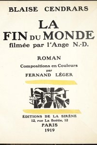
Author: Blaise Cendrars (1887 - 1961)
Artist: Fernand Léger (1881 - 1955)
Publisher: Éditions de la Sirène
The end of the world as a film
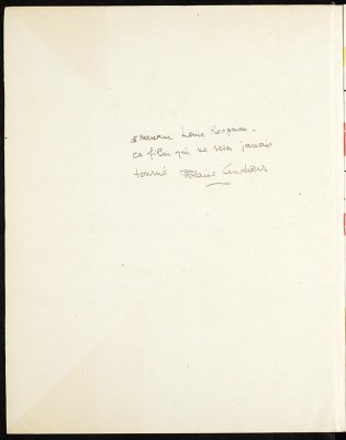
Cendrars worked as literary adviser for publisherA la Sirène in 1918 and 1919, after which he declared himself general manager (though it is uncertain whether he actually held this position). He wasn't responsible for the firm's business correspondence, and he spent more time outside Paris than in the city. During this period, Cendrars worked as an assistant for the innovative French filmmaker Abel Gance. His interest in films is further demonstrated by titles like The end of the world filmed by the angel N.-D. and L'abc du cinéma (1926), written in defence of cinema. Judging by the autograph dedication left by the author in the Koopman Collection's copy of this ABC, he considered cinema 'a new global language'. Film wasn't the only reason for him to travel: he was enough of an adventurer/journalist to traverse Asia at a young age.
Cendrars' style is associative and witty to the point of roughness. La fin du monde gets off to an impressive start: 'God the father sits behind his cylindrical desk'. God hastily signs piles of documents. He interrupts his work for a telephone conversation and calls together his district heads. The spiritual leaders of the world- from the pope to Rasputin - have to present their figures to him. He sends them away and makes up the balance: it has been a good year. The World War has yielded many new souls. The film continues: God travels to Interlaken and onward to Mars, and pours out every conceivable plague upon mankind, all to maximise the company's profits. The world is depopulated and is overgrown by vegetation. After 51 short chapters, the film quickly winds back onto the reel, the world is created anew and God is back behind his desk. But there is one crucial difference: he is now bankrupt.
Art Deco and modern men
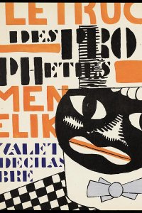
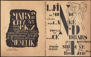
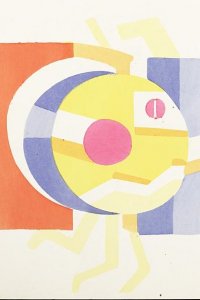
The illustrations by Fernand Léger make this book exceptional; it has indeed become a much sought-after artist's book that expresses the 'rhythm of its time'. Léger had known the author since 1910. In 1919, the book's year of publication, Léger had his first solo exhibition. Besides the publisher's device, he created seven full-page illustrations, four vignettes, five illustrations for the chapter titles and three illustrations spread across two pages. He also designed the front and back cover in the same style: abstract and Cubist. Most illustrations were done in a combination of two colours from a selection typical of Art Deco: black, orange, yellow, blue, red, pink. The text and illustrations are woven together; coloured vignettes are visible under the text, and the illustrations include letters and numbers, advertising slogans and quotations that conjure up a hectic image of modern city life.
Léger also designed the typography for this book, composed of a robust 24 point Morland face, which gives the book a black, mechanical appearance. There is a clear relationship between film and illustrations. The story, narrated as in a screenplay, is also told through Léger's typographical experiment with hand-written letters and with various typefaces in the decorations, with boxed letters and symbols in large display type, like neon lights at night. This is how modern man imagined the end of the world, as through the lens of a camera shooting film. This book was important to Léger, as it helped to define his ideas on mechanisation and painting, preceding his meetings with Le Corbusier, Van Doesburg and Mondriaan. Léger himself was also very active as a filmmaker; witness his famous Ballet mécanique from 1924.
![La fin du monde filmée par l'ange N.D, pagina [31]: titel van hoofdstuk 5](/sites/default/files/styles/galerie/public/images/la-fin-du-monde-filmee-par-l%27ange-ND-p31.jpg?h=b203db40&itok=sUmDE-cr)

![Eerste tekstpagina (p. [4]) met frontispice (p. [5])](/sites/default/files/styles/galerie/public/images/la-fin-du-monde-filmee-par-l%27ange-ND-p4-5.jpg?h=58e56fdf&itok=J6pfMNlw)
